What is Data Visualisation?
Unlock the power of data with our comprehensive guide on data visualisation. Learn what data visualization is, its significance, various types, and tools.
In an era where data is ubiquitous, understanding and interpreting this vast amount of information has become a critical skill. This is where data visualisation (or dataviz) comes into play. Data visualisation is the art and science of translating complex data into visual formats that are easy to understand and interpret. This blog explores the concept of data visualization, its importance, types, and tools.
The Essence of Data Visualisation
Data visualisation involves converting numerical and textual data into visual contexts, such as charts, graphs, and maps. This practice helps in making sense of large volumes of data by highlighting trends, patterns, and outliers in a way that is quickly digestible.
Why is Data Visualisation Important?
- Enhanced Understanding: Visuals help in processing information faster than text or numbers, making it easier to grasp complex concepts or identify new patterns.
- Effective Communication: Data visualisations can communicate stories to a target audience more effectively than raw data, especially in business or research settings.
- Data-Driven Decision Making: By revealing trends and insights, data visualisations aid organisations and individuals in making informed decisions based on empirical evidence.
Types of Data Visualisation
- Charts and Graphs: Including bar charts, line graphs, pie charts, which are ideal for comparing quantities or showing trends over time.
- Infographics: Combine graphics with data to present an overview of a topic in an engaging way.
- Heat Maps: Show the density or intensity of variables, using color variations.
- Scatter Plots: Ideal for showing the relationship between two variables.
- Geographical Maps: Used for displaying data with a geographical component.
Tools for Data Visualisation
There are numerous tools available for data visualisation, ranging from simple to advanced, including:
- Tableau: Known for its powerful and user-friendly interface.
- Microsoft Power BI: Integrates seamlessly with other Microsoft products.
- Google Data Studio: A free tool that integrates with various Google services.
- D3.js: A JavaScript library for producing sophisticated, interactive visualisations.
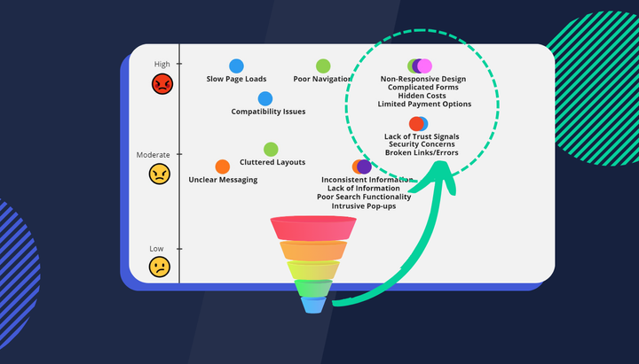
- Insightech: Offers unique visualisation features like click and scrolling heatmaps, funnel, and pathing visualisations for website analytics.
Best Practices in Data Visualisation
- Know Your Audience: Tailor your visualisation to the understanding and interests of your audience.
- Keep It Simple: Avoid clutter and focus on presenting data most clearly and concisely.
- Use Color Effectively: Colors should enhance the ability to interpret data, not distract from it.
- Ensure Accuracy: Misrepresenting data can lead to incorrect conclusions, so accuracy is paramount.
visualisation
As technology advances, so do the possibilities in data visualisation. We are seeing trends like interactive visualisations, real-time data streaming, and the integration of AI for predictive analytics. These advancements are making data visualisation an even more powerful tool in various fields.
Conclusion
Data visualisation is a powerful technique for making sense of the complex world of data. It not only simplifies the understanding of large data sets but also aids in effective communication and decision-making. As we continue to move into a data-driven future, the role of data visualisation in business, science, and education will only grow in importance.