Click vs. Scroll: The key to maximising 2023 eCommerce conversion rates
Nike’s online shop has for years optimised product pages by how their users behave prior to purchase. Understanding which behaviour is dominant on your website is key to increasing conversion rates.
- Product images in a carousel are designed for clicking, not scrolling behaviour
- Nike's online store optimises its product pages by using infinite scrolling
- Understanding which behaviour is dominant on your website is key to increasing conversion rates
For eCommerce operators, 2023 brings with it a raft of challenges, not least of which is the need to boost sales in a worsening economic climate. Conversion rate optimisation is a great place to start.
For benchmarking purposes the average eCommerce conversion rate is around 2-3% (BigCommerce). BigCommerce actually recommends setting a baseline target of 3%.
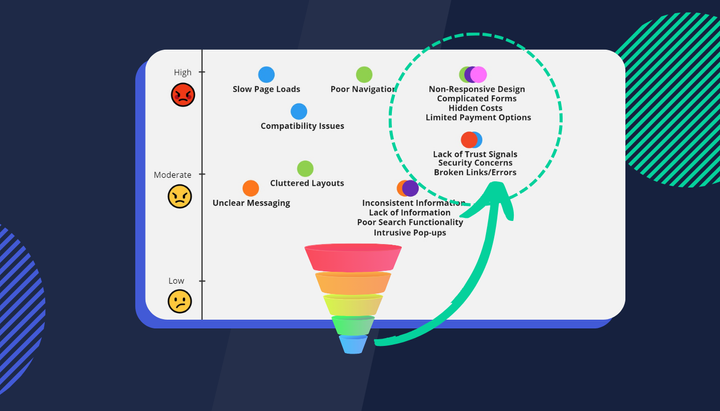
There’s no shortage of A/B tests or page optimisation hacks you could apply to uplift your conversion rates. A/B tests can go wrong when the underlying assumption behind the experiment turns out to be false or is based on siloed data. With a limited budget and reduced margin for error, it’s imperative to prioritise all your AB tests to increase your chance of a successful outcome.
Case Study: Nike’s (semi) infinite scroll on their product pages
Nike’s online shop has for years optimised product pages by how their users behave prior to purchase. Infinite scrolling is when content (such as products on a listing page) loads continuously as the user scrolls down the page.
“Infinite scrolling typically works best for situations where users will want to scroll through homogeneous items with no particular task or goal in mind — for example, entertainment, news, or social media.” - nngroup.
As mentioned above, eCommerce brands use this approach to eliminate the need for pagination and uplift conversion rates. What Nike does is apply this design principle to their individual product pages as well.
@Nike's iconic website features interactive product pages and picture-perfect filtering for a seamless shopping experience. https://t.co/r5U2mWCWey pic.twitter.com/F6bKsyjrqU
— DesignRush / Spotlight (@designrushmag) March 20, 2018
Loving the recent developments on the @Nike website improving #ux #cx of their product pages. From the #carousel images, to the #videos, #shoes sizes on display, catchy copy & ease of #social sharing! https://t.co/nX04Tje97B
— Leeroy Stefan (@leeroy_stefan) March 10, 2018
They’ve effectively killed the traditional image carousel found in most eCommerce stores. Why? Because they have the digital experience insights to know their users prefer to scroll prior to converting rather than clicking through product images. They’ve not reverted back to the carousel either so it’s safe to assume this relatively small change is getting results.

Infinite scroll applied to product listings improves usability (top marks for making the digital experience better). If applied to your product pages, however, users are more likely to see a greater percentage of all the product images. This is important because product imagery is what sells that product to users.
A report from Etsy actually found;
“90% of shoppers said the quality of the photos were ‘extremely important’ or ‘very important’ to a purchase decision”.

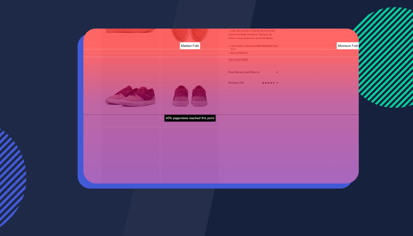
Other areas include price, shipping and social proof elements. Nike found a clever way to guarantee users were also exposed to this vital information while engaging in scrolling behaviour. They did this by fixing the product information to a left panel. This includes product reviews.

Above the fold, you see initial product information, price and stock supply information (sizing).
As users engage in scrolling behaviour triggered by the high-quality images (there’s also a 5-second video loop mixed amongst the images for good measure), more of the product description is revealed along with the reviews.
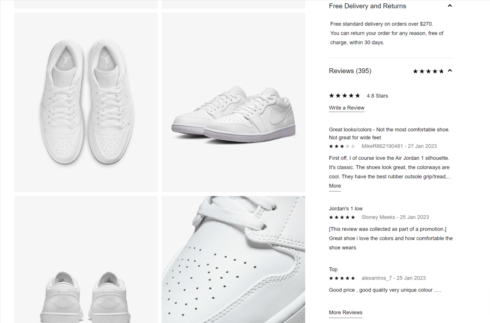
In the Etsy report, 73% of their surveyed users said reviews and social proof were vital to their purchase decision-making process. While almost all stores have reviews on their site, what Nike does differently is they’ve put serious thought into when exactly they want reviews to be read.
At the bottom of the page, users can find additional social proof elements to reinforce their purchase decision if they happen to still be on the fence.

This is a great way to incorporate digital experience insights into your page designs if you know a certain behaviour is driving conversions.
Qualify the problem on your website
While insights are powerful there are some hurdles to overcome. At a high level, these challenges always come back to difficulty finding relevant session replays where users exhibit specific behaviours (for example clicking through image carousels vs. scrolling down the page).
Before you can prioritise your next AB test you first need to understand if this is a problem in the first place. Each website will be different so here are a few questions to consider:
- Are there any specific product pages where users scroll more than click?
- What impact does scrolling have on the conversion rate for that product vs. the overall average?
- What’s the conversion rate impact when users see X% of the total images available for that product? It’s interesting to understand the conversion impact if you have between 6-10 images hidden inside a carousel. If users click more than they scroll but convert more after seeing the 5th image in the carousel then what would the uplift in conversion rate be if more users could see that 5th image?
- How confident are we that we truly understand the problem? This is one area where the user's digital experience can be influenced by a cognitive bias known as the framing effect. GA tells you the carousel had 17 clicks on average per session but watching session replay shows us those users were actually clicking the carousel so fast it’s obviously impossible for them to meaningfully engage with the imagery. You’ll have to answer why they are doing this.
With the right tech behind you, anyone can answer these questions.
Insightech was designed to answer why some of your website users convert better than others. With this data, you’re armed with accurate insights to confidently make decisions about the digital experience. You can use these insights to improve your chances of finding clear winners from your AB tests and make incremental improvements each week. Ultimately this always comes back to the same outcome, finding quick wins that lift your overall conversion rate.
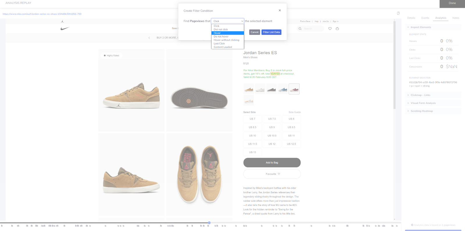
In the above example, we’re able to segment users who hovered their mouse over a specific coupon code on a product page. From here we get a quick list of all the relevant session replays.
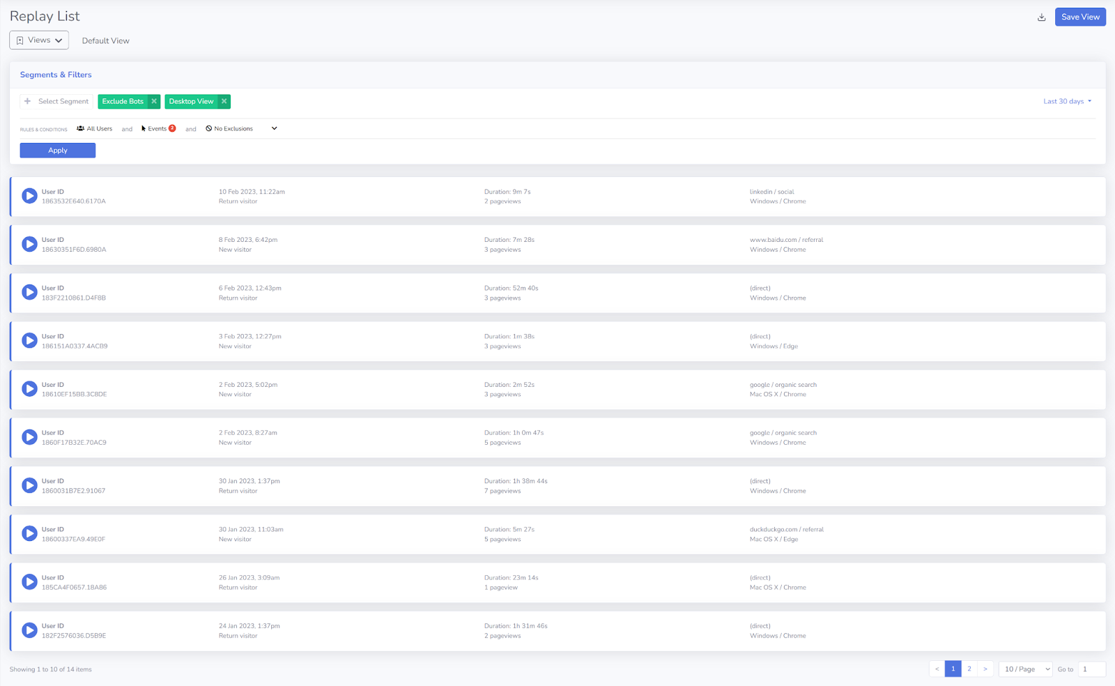
Additional filters can be applied to look at those users who came from a particular marketing campaign (for example an email promotion).
Filtering is as simple as interacting with elements on the page either from within the session replay. You can also do this from your own browser with the handy Insightech browser extension.
If you would like a demo our team would be happy to show you how it works on your website so you can start unlocking those easy wins and lift conversion rates.