8 common causes of digital experience friction
Addressing and eliminating friction points on a website is important for improving the user experience and driving business success.

If your website or app is difficult or unpleasant to use then you've got friction. In fact, (32%) of customers will walk away from a brand they love after just one bad experience (PwC). The problem is organisations tend to overestimate the satisfaction of consumers with self-service tools. Digital experience research conducted in 2022 by CX vendor NICE found 15% of consumers report being very satisfied. The report also found a gap between business and customer expectations with 41% of consumers willing to look at competitors after just two poor interactions. Business leaders meanwhile believe it takes three or more before reaching this critical threshold.
What causes friction?
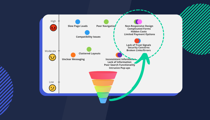
Friction can occur on your website for a number of reasons:
- Page load times: Poorly optimised pages are destined to leave users frustrated. Nobody has the patience to wait 16 seconds for a landing page to load. We ran a quick test to examine the average page load times for three car insurance landing pages. The results ranged from 8.5 seconds (not too bad but could be better to 15.1 seconds (quite bad). For benchmarking purposes, financial service landing pages should load in 5.1 seconds. These pages were all direct landing pages from paid google search campaigns.
- Navigation menus are not intuitive: Confusing or cluttered navigation are unnecessary revenue blockers.
- Lack of mobile responsiveness: Websites that are not optimized for mobile devices can be difficult to use on smaller screens, leading to frustration for users.
- Dead ends: Broken links, broken forms, coupon codes, checkouts and other error messages are frustrating for users and will cause them to leave.
- Unclear or confusing information: Websites with unclear or confusing information can be difficult for users to understand. The impact is magnified for industries such as financial services or higher education where customer journeys are content-heavy compared to your typical eCommerce search and add-to-cart customer journey.
- Poor UI/UX: You only have a few seconds to leave a good first impression. Websites with poor design or an outdated look can be unappealing to users. Consumers have a limited time to spend searching for a product online and they won't waste it on a website they think will make it hard to find what they're looking for.
- Poor search functionality: This seems like a simple one but websites with poor search functionality can be difficult for users to find the information they are looking for.
- Customers want security and privacy: This should be obvious after the recent Medibank data breach but websites not adequately protecting user data or that have had security breaches in the past may cause users to feel concerned about using the site. This friction point is unique in that it occurs well before the digital experience journey starts.
How do we solve this problem?
Fix the low-hanging fruit: The obvious elephant in the room is SEO. Above-average page load times impact your website conversion rate. Enter your URL into this free tool from Google to get a quick digital health check for your website. As an example, the industry average page load times for Financial Services should be less than 5.1 seconds.
Streamline the digital journey: This is possible for any brand, even content-heavy ones such as banking, finance or education where consuming large amounts of information is a normal part of the process. Consider content analysis to identify the key information your prospects need to see or interact with to be more likely to convert into customers. If you're unsure how to do this please email us here and we'll share how to do this. You can also subscribe to this magazine because we talk about it a lot! Just keep in mind while seamless is the goal it should never be taken to the extreme. After all, if we built a truly seamless experience your website landing page would just be nothing more than a conversion form or checkout!
Personalise your digital experience: Start by collecting as much data as you can on who visits your website, then segment this data into discrete audience segments. Use targeted messaging and product offerings then limit who can see what based on the segment they belong to. Recommending products or services based on a user's past interactions with your website can also help you provide a more tailored and relevant experience.
Build clear conversion pathways: Use clear and prominent calls to action to guide users through the customer journey and encourage them to take the desired action. Personalise this by factoring in all your audience segments such as mobile users, new vs. returning users, current customers, app referrals, traffic from google search or third-party platforms etc. Also, consider what the highest impact conversion point is for your organisation - is it requesting an insurance quote, opening a new account or just visiting a key URL and consuming the majority of the content on that page?
Address your time to conversion: Reading or interacting with content on your website (even content before or after visiting your website) is a key part of your customer's digital experience. While we should be careful to over-engineer or streamline this research phase, one area which should be refined as much as possible is what happens after your website visitor decides to convert. Research from Stripe in 2022 has found "The average checkout takes more than three minutes...yet 60% of shoppers will abandon their cart after two minutes of trying to pay". If you don't want to leave any extra revenue on the table take some time to consider how complicated the pointy end of your conversion funnel is.


