5 Quick Ways to Validate Website Page Designs
Customers are complex, and how they interact with your brand will be unique. With a combination of the right AB testing approach and using tools you already have such as GA4 / Adobe Analytics, you can turn a poor digital experience into a positive one that converts more users.
In this article:
- Why each website has its own mix of unique users
- Challenges in getting the right data on which page features drive the most conversions on your website
- Where AB testing can go off the rails in website optimisation
- Nike industry study - pros and cons of copying the gold standard
- 5 areas to focus on when validating page template designs
According to Gartner, “People like to buy from websites they find easy to use and navigate.” 63% of users will abandon the brand if their experience with it is poor. Customer loyalty also doesn’t seem to matter much if the experience is poor, with 73% agreeing “I am loyal to brands, but as soon as I have a bad experience with them, I move on.”
On websites, the challenge is improving the digital experience and reducing friction for users who want to convert.
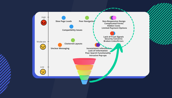
Here are some numbers from Baymard to consider:

As you can see, 70% of the reasons why users don’t convert all relate specifically to their digital experience with that brand. Don’t be intimidated by these numbers however as you can impact all of them using a combination of the right AB testing approach and using tools you already have such as GA4 / Adobe Analytics.
Challenge #1 - Customer needs are complex and unique
Customers are complex, and how they interact with your brand will be unique. Here’s a visual from adzooma which highlights just how complex:

While it’s hard to make sense of which users fall into which segments using traditional web analytics tools we can still optimise page template design for them with the right data.
Purchase journeys are also complicated and understanding them can be difficult.

Layered on top of unique behavioural, geographic and psychographic dimensions is buying intent. Not all users who visit your website (or indeed make it to checkout) will have a purchase intent. Some are there to window shop and evaluate their options. Connecting the two seamlessly with new optimisations can take a lot of effort.
Challenge #2 - Getting the right data on page features can be difficult
Measuring all the features on your website can be very time-consuming. As you can see in the below table, there are many elements or page features that comprise a typical page template design.

Your website probably has a few of them already but it would be unwise to assume special offers will convert more shoppers through your funnel if you’re in e-commerce or an FAQ section will increase your application conversion rate as a bank/insurance company. Just because everyone else is doing it, doesn’t mean those features are conversions for your unique users. It’s difficult to measure conversion impacts for what users see on a page without a lot of manual effort and ongoing maintenance.
Challenge #3 - Keeping an efficient optimisation process can be challenging
Lastly, it’s clear AB testing takes time and a lack of good-quality data can slow down the whole process. Reaching statistical significance for AB tests can only be increased through higher volumes (throwing lots of marketing spend to attract new users to your website) or testing less for a longer period of time. With so much, you could be AB testing that’s a clear challenge.
VWO says only 1 in 7 AB tests are actually successful. They also say tests typically take between 2-4 weeks to achieve statistical significance. That’s a low success rate and long lead time to bank on when reworking how your pages present information to your unique users. If we can quickly identify what high-intent users need to see at specific moments in their journey to be more likely to convert then we are going to be well-positioned to prioritise AB tests.
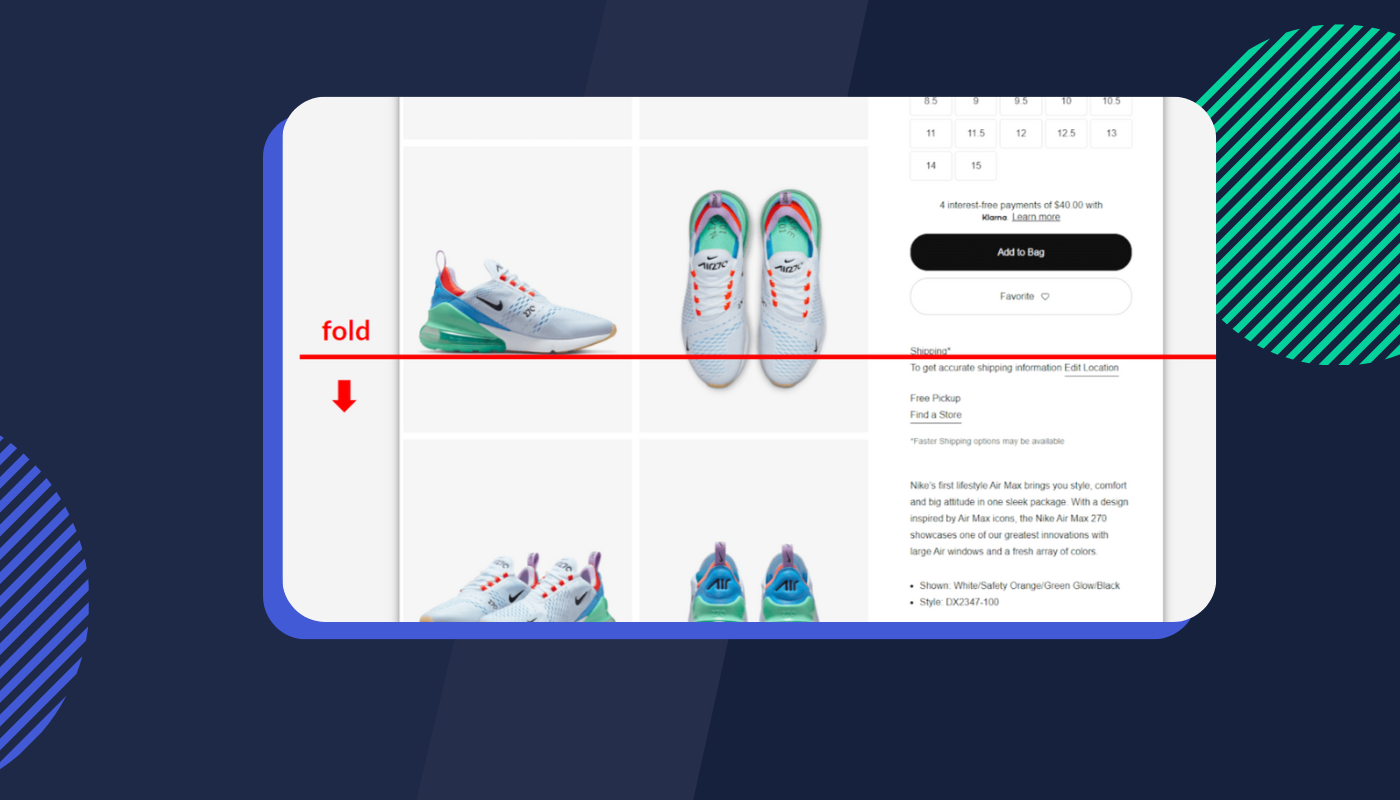
Nike serves as a good lesson here. In the product world, Nike’s been seen as a gold standard for e-commerce page template design.


The design offers a fresh and smooth user experience. Product images are large and impactful (not hidden within a traditional carousel) and content is optimised for above the fold (at least on a desktop). As users scroll down to view product images, page features such as size selection, shipping information and a store locator are pinned to the right panel.
What Nike does well here is to link a specific user behaviour (in this case scrolling) to key content users might need to see or interact with to be more likely to convert. There are a few downsides to this design, namely SEO impacts on page discoverability, higher load times and GA & Adobe Analytics struggling to measure image viewability.
While you might be tempted to AB test this design on your own product pages it’s worth mentioning you’ll need a bit more information. Firstly, what user behaviours are you observing in users?
Traditional session replay tools such as Hotjar will sample replays so finding relevant ones can be a bit hit and miss. Ideally, you’ll want to study the experience of users with buying intent who converted.
You’ll also want to measure the conversion rate impact of each page feature (more on this later). We don’t know for sure if Nike’s converting users prefer scrolling behaviour or which specific mix of page features drive the most conversions for them.
Even if we did, it’s always best to find what works best for your own users across your unique website.
We found Nike’s Gold Standard approach to page template design isn’t that standard anyway. Of the following brands competing within the men’s athletic shoes category, only 40% copy Nike’s page design.

Brands approach page design differently. There’s no clear way to know what will work best for you without rigorous AB testing.

So what should you be measuring from your page templates?
- The visibility of your content
- Conversion impacts (across both clicked, or seen content)
- What facilitates researching pathways
- The impact of your social proof
- The key user journeys involving your key pages
1. Visibility of Your Content
Our objective here is to identify content viewability and how much real estate you actually have to work with on your page.

Above-the-fold content is obviously prime real estate but this doesn't mean you have to stuff lots of content above the fold. Buttons with anchor links can transition users further down the page.
Common Questions
- Where are most users dropping off on your page?
- Is your key content actually being seen?
- How much viewing real estate do you really have to work with?
- Do these behaviours change for new vs repeat, or converting vs non-converting?
2. Conversion Impacts
Identify high-converting behaviours to amplify and poor-converting behaviours to optimise. Good experiences can be designed around the behaviours users already exhibit on your website.

Common Questions
- What drives the most revenue, and where can we amplify this?
- What has poor conversion rates (for the position), and needs to be optimised?
- What has high conversion rates, but low visibility / under-utilised positioning?
- What are the conversion rates for the content that is only ‘seen’?
3. What Facilitates Researching
Identify the highest engaged content & pages when users first arrive at your website.
Common Questions
- Which pages have the highest engagement?
- Which page features are used most? (Filters, FAQs, reviews, search)
- What search terms & features are used most?
- How do these compare to converting sessions?

4. The Impact of Your Social Proof
Identify how valuable your social proof is to improving your conversions.
Common Questions
- How much do your reviews impact conversion rates?
- Where can you increase visibility across product, category and listing pages?
- How much effort should you put into generating more social proof content?

5. The Key User Journeys
Identify the role your page plays in your most common user journeys. Pathing reports can be a great way to visually see the impact a store locator feature has on conversion rates. Are they dead ends or valuable touchpoints in the buying journey? Visualisations such as these go way beyond simple page-depth metrics you’ll find in GA reporting.

Common Questions
- How do users navigate to your page?
- Which pathways are leading to conversions?
- What is happening after your page/feature?
- What flows/pages are unexpected?
Key Takeaways
1. Choose the right tools
- Full visibility across customer experiences
- Allows you to compare feature performance quickly
- Combines quantitative and qualitative data
2. Spend time understanding your customers properly
- Visibility of Content
- High and low-converting features
- Research facilitating activities
- The value of your Social Proof
- Your key user journeys
3. Speed up your AB testing process
- Focus on the biggest conversion opportunities first
- Faster statistical significance will drive faster outcomes
Free eBook: Comprehensive guide to navigating the complex process of website re-platforming.
- Identifying Limitations of the Current Platform
- Aligning Re-platforming Goals with Business Strategy
- Conducting a Comprehensive UX, Marketing and Tech Audit
- Questions to consider when analysing your site’s digital experience
If you'd like a demo of Insightech let us know how we can help you optimise your website for more conversions this year.